Reading your analytics
An overview of the Analytics area in your Orbit dashboard, with links to every guide on the Analytics page, Reports and Live View.
The Analytics area of your Orbit dashboard shows how your store is performing. It covers sales, orders, customer behaviour, traffic sources, conversion and fulfilment progress. Use it to see how a period went, where your customers came from, what sold, and where visitors stopped before buying.
Open Analytics
- From your Orbit dashboard, go to Analytics. It sits under Insights in the left-hand menu.
- The Analytics page opens with your figures for the last 30 days.
- To open the other two pages, click Reports or Live View in the submenu under Analytics.
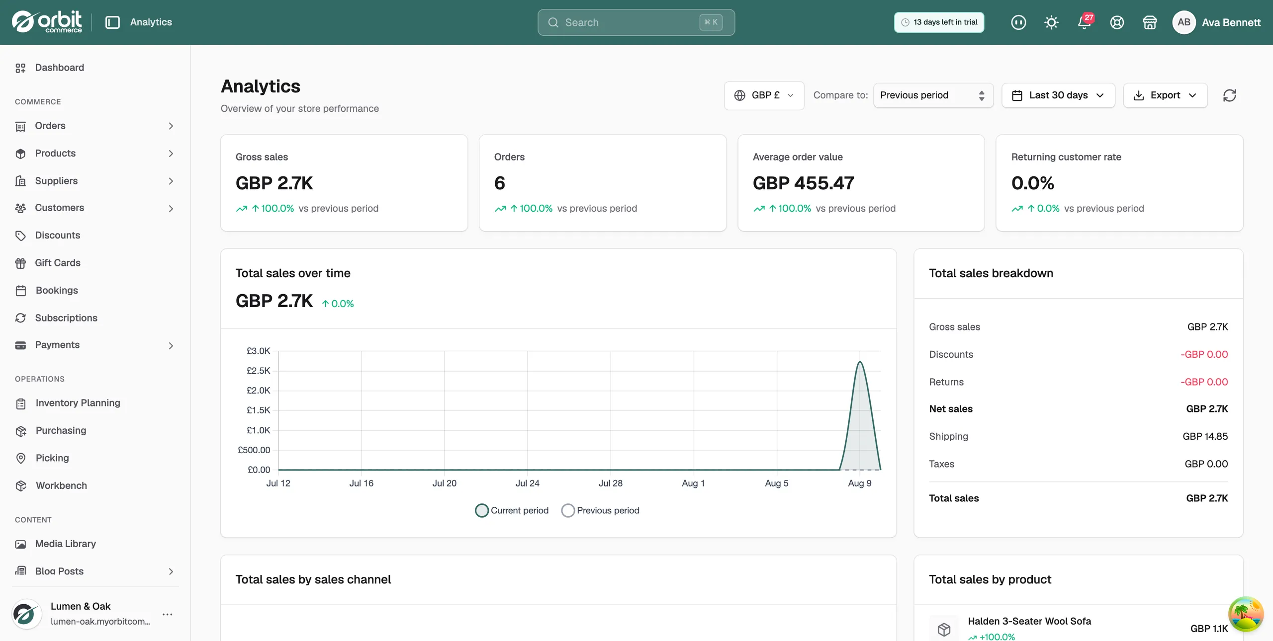
The three Analytics pages
- Analytics: a summary of a period you choose, as cards and charts. Start here.
- Reports: 34 detailed reports grouped into six categories. Open one to see the figures behind a card, then download it.
- Live View: what is happening on your store at this moment, including visitors, carts and purchases.
Booking utilisation
The Booking utilization panel shows the share of your available service slots that customers booked. It gives one overall figure for the period you chose, with the slot count beneath it, such as "12 of 40 slots used". Under that, a bar and a percentage for each service show how full each one was. The panel appears only when your store sells service products and has bookings, so a store with only physical or digital products does not see it.
- Overall utilization: the share of all your service slots that customers booked in the period.
- Service: the service product, with the slots booked out of the slots available.
- Usage: a bar showing how full that service was.
- %: the same figure as a percentage.
Digital downloads
The Digital downloads panel counts customer downloads of your digital files in the period you chose. Two figures sit at the top, and a table below them lists each digital product. The panel appears only when your store has digital downloads, so a store that sells only physical products does not see it.
- Total downloads: how many times your files were downloaded in the period.
- Unique customers: how many different customers downloaded a file.
- Product: the digital product, with a bar comparing it to your most downloaded product.
- Downloads: how many times that product was downloaded.
- Customers: how many different customers downloaded it.
Read the Analytics page
Run and export reports
Watch your store in real time
Check your figures from the dashboard
Why your analytics matter
Individual orders tell you what happened once. Analytics tell you what is happening across a whole period. Checked each week, they answer questions you cannot answer from an order list.
- Are sales going up or down against the period before?
- Which products are selling, and which are not?
- Where are your customers coming from?
- Where do shoppers stop before they buy?
- How many orders are still waiting to go out?
Those answers guide decisions on stock, pricing, marketing and changes to your shop.
Tip: New to your figures? Start with Understanding your analytics figures. It explains every card and chart on the Analytics page in the order they appear.
Was this helpful?
0 people found this helpful