Adding a Mini Cart element
Add a basket icon with an item count that opens a drawer or popover. Covers display modes, badge, panel text and button labels.
2 min read3viewsUpdated 16 September 2026Orbit Support Team
The Mini Cart element is a basket icon with a count of the items inside. Customers click it to see what they have added and go to checkout, without leaving the page. It belongs in your header so the basket is one click away everywhere.
Add the element
- In the page builder, click Elements in the toolbox on the left.
- Click the Ecommerce group, or type the name in Search elements....
- Drag Mini Cart onto the canvas and drop it where you want it. The panel closes on its own.
- Click the element on the canvas. Its settings open on the right, with a Content tab and a Design tab.
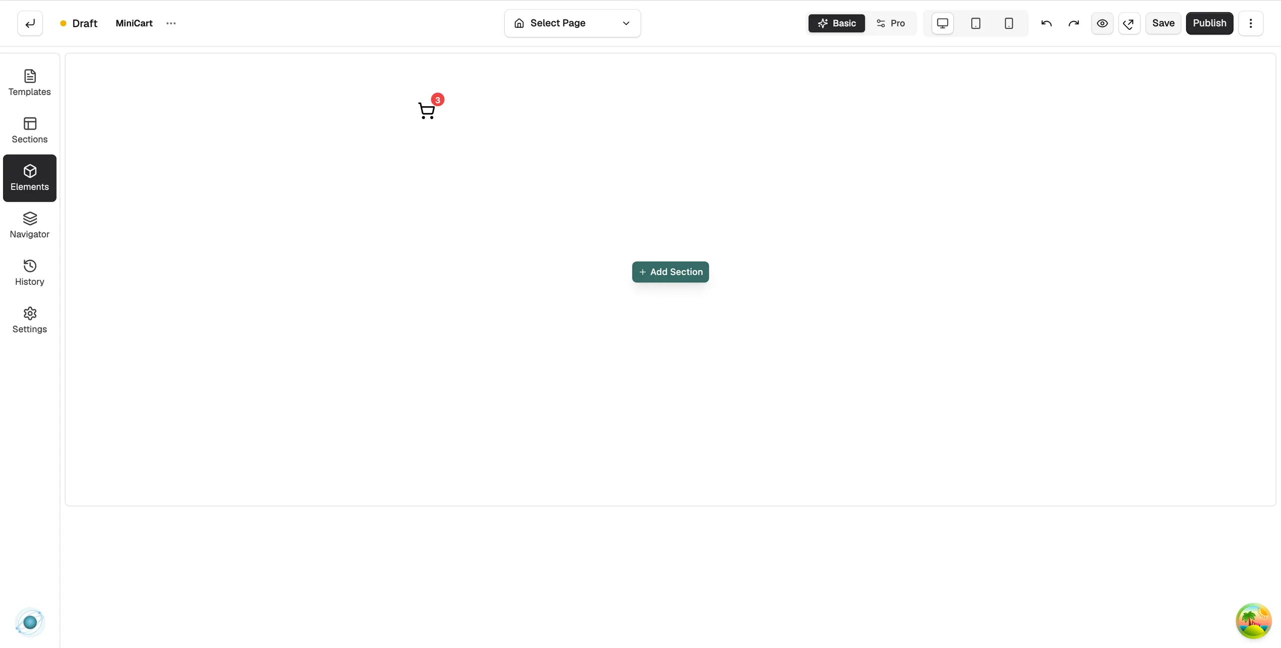
Note: In the builder the badge shows a sample count so you can see how it looks. On your live store it shows the real number of items.
Content settings
- Display Mode: how the basket opens on desktop: Slide-out Drawer, Popover, Dropdown or Link to Cart Page.
- Mobile Display Mode: the same choice for small screens: Same as Desktop, Slide-out Drawer, Full-screen Sheet or Link to Cart Page.
- Drawer Side: Right or Left, when the mode is a drawer.
- Backdrop Overlay: dim the page behind the open drawer.
- Open on Add: open the basket each time a customer adds an item.
- Icon: the basket icon.
- Show Badge: show the item count on the icon. Badge Position puts it at Top Right, Top Left, Bottom Right or Bottom Left.
- Popover Position: where the panel opens when the mode is Popover: Bottom Right, Bottom Left or Bottom Center.
- Popover Title: the heading in the panel. The default is Cart.
- Empty Cart Text: the message when there is nothing in the basket. The default is Your cart is empty.
- View Cart Text and Checkout Text: the labels on the two buttons in the panel.
Design settings
Open the Design tab to set the icon size and colour, the badge colours, the width and colours of the panel, and the button styles. For what the Design and Advance tabs do on every element, see Using the element settings panel.
Related guides
Was this helpful?
0 people found this helpful