Designing your cart page
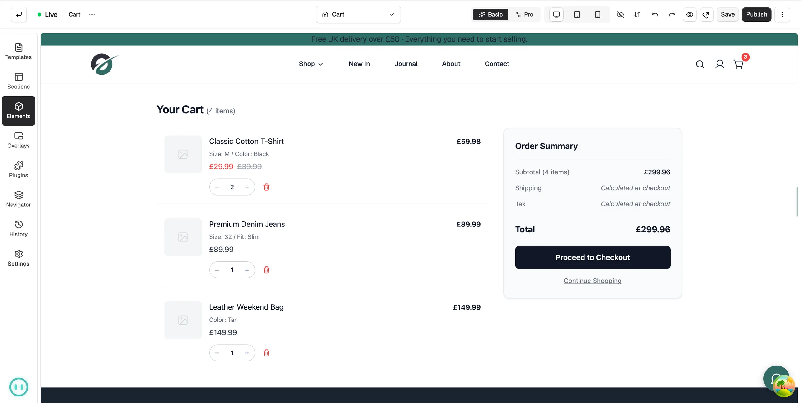
Design the cart template with the Cart Page element: choose the layout, pick what each basket row shows, and set your own wording.
Your cart page is where customers check what they are buying before they pay. You design it in the page builder. One element, Cart Page, holds the whole basket: the items, the order summary and the checkout button.
Considerations
- The Cart Page group of elements only appears while you are editing a cart template.
- The basket on the canvas is sample content. On your shop it fills in with the customer's own items.
- Saving keeps your work as a draft. Customers only see the new design once you publish it.
Open the cart template
- From your Orbit dashboard, go to Storefront, then Templates.
- Click the Cart tab.
- Click the template row. It opens in the page builder.
Add the Cart Page element
Most themes already have this element. If your template is empty, add it like this.
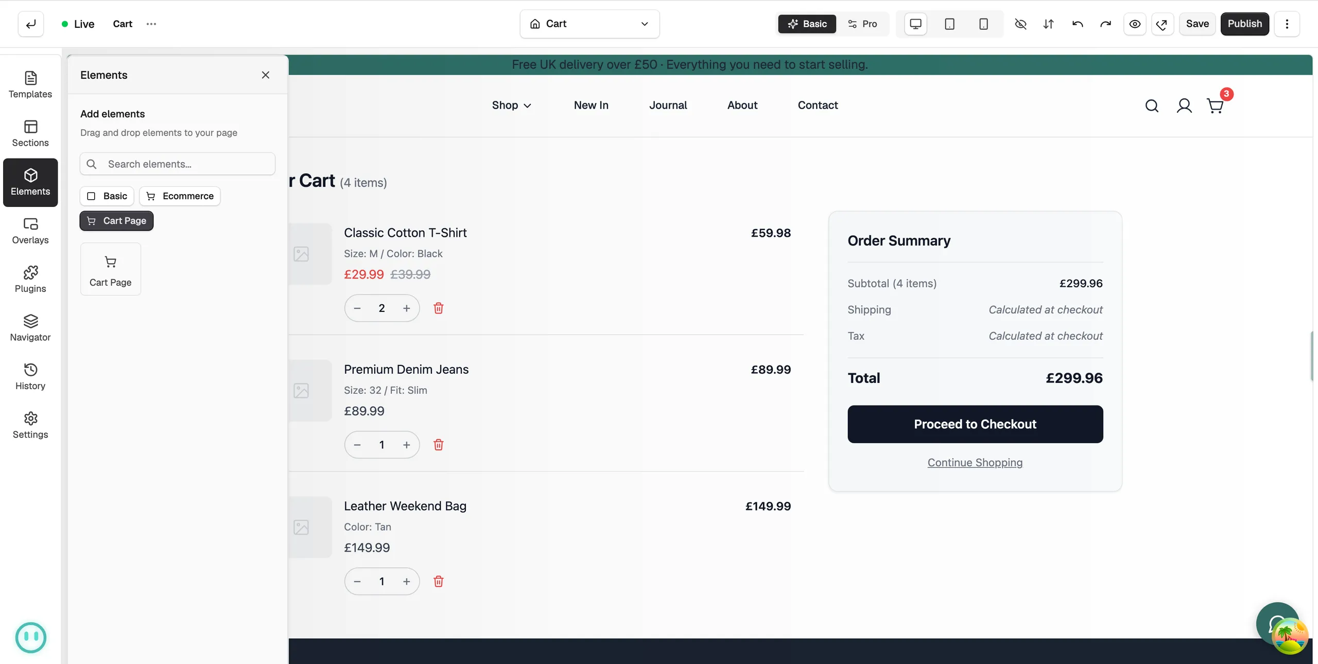
- In the toolbox on the far left, click Elements.
- Click the Cart Page chip.
- Drag Cart Page onto the canvas, or click the tile to add it.
- Click the element to open its settings on the right.
You can add other elements around it, such as a heading, payment icons or a line about delivery and returns.
Choose what the cart shows
Open the Content tab. The settings are grouped.
- Layout: Layout is Two Column or Single Column. Two Column adds Column Ratio, the split between the items and the summary. Column Gap and Item Gap set the spacing, and Stack on Mobile puts the summary under the items on a phone.
- Sections: switches for each part of a basket row, including Cart Header, Item Image, Variant Info, SKU, Unit Price, Compare at Price, Quantity Selector, Remove Button, Line Total, Dividers and Clear Cart Button.
- Order Summary: Estimated Shipping, Estimated Tax, Continue Shopping and Trust Badges.
- Enhanced Features: Order Notes lets customers leave a message, with your own Notes Label and Notes Placeholder. Free Shipping Bar shows how far off free delivery they are, set by Threshold Amount.
- Empty State: Show Empty State, plus the Title, Message, Button Text and Button URL a customer sees when the basket is empty.
Change the wording
The Text group holds every label on the page, so you can match your own voice. It covers Cart Title, Checkout Button Text, Continue Shopping Text and Continue Shopping URL, Clear Cart Text, the Subtotal Label, Shipping Label, Tax Label and Total Label, and Trust Badges Text.
Note: In the free shipping message, type {remaining} where the amount should go. It already includes the currency symbol, so do not add a £ of your own.
Style the cart
The Design tab styles each part on its own. The groups include Typography, Price Colours, Product Image, Cart Items, Quantity Selector, Remove Button, Checkout Button, Order Summary, Free Shipping Bar, Empty State and Background.
Save and publish
- Click Save. Your changes are kept as a draft.
- Click Publish, then confirm. The new cart page is live.
Related guides
Was this helpful?
0 people found this helpful