Using the element settings panel
Learn the Content, Design and Advance tabs, how to set an element per device, and what Basic and Pro modes change in the page builder.
Every element in the page builder is set up from the settings panel on the right. Click an element on the canvas and the panel opens. Its tabs are Content, Design and, in Pro mode, Advance.
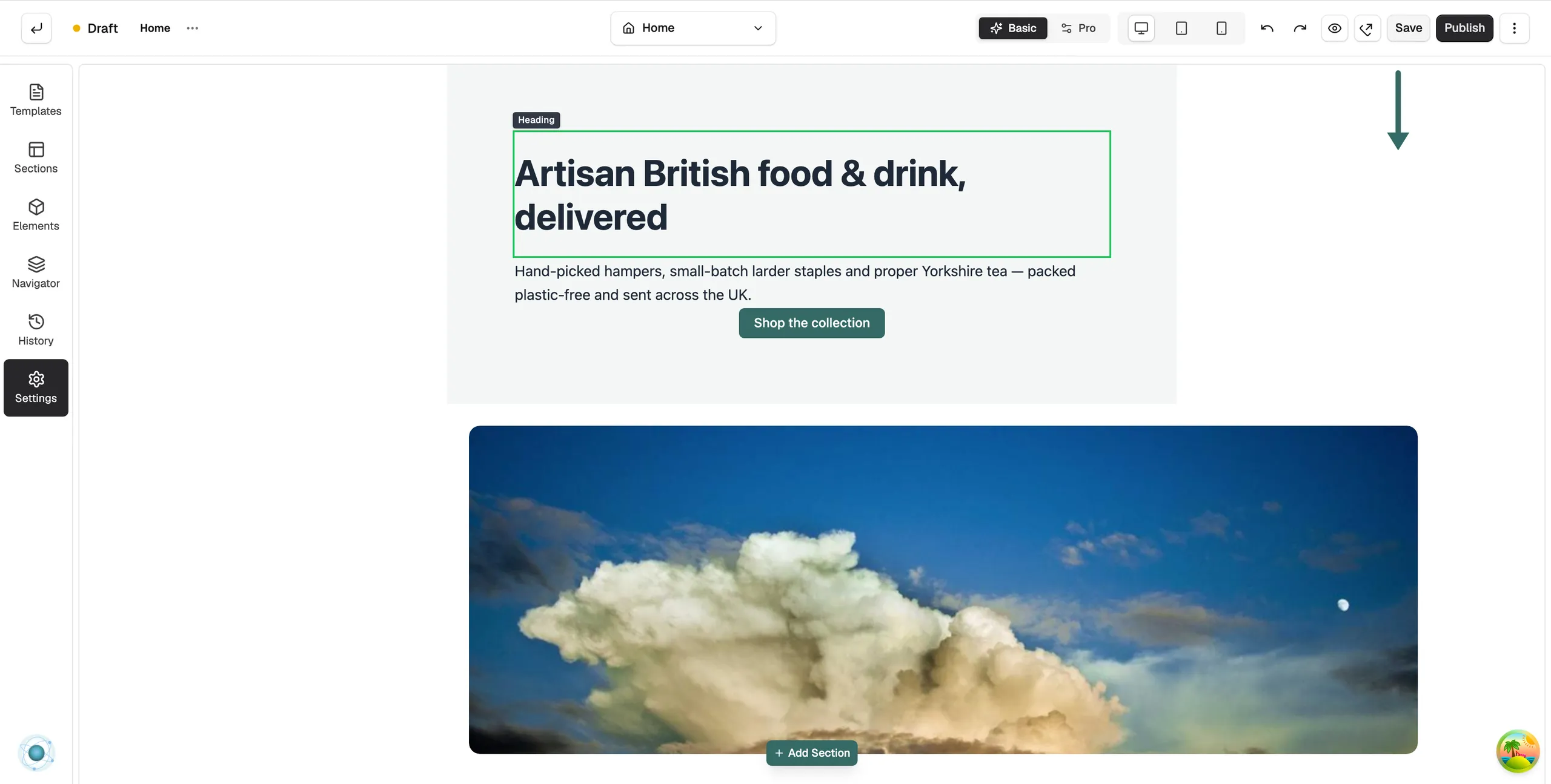
Open the settings panel
- Open the page in the page builder. For your homepage, go to Storefront, then Themes, and click Customize.
- Click any element on the canvas. The panel opens on the right, headed Editing and the element's name, such as Editing Heading.
- To rename the element, click Rename element next to the name, or double-click the name.
- To remove it, click Delete element.
The Content tab
The Content tab holds what the element shows. For a Heading it is the text and its tag. For a Button it is the label and the link. For an Image it is the picture and its alt text. For a Section, Row or Column this tab is called Layout instead.
The Design tab
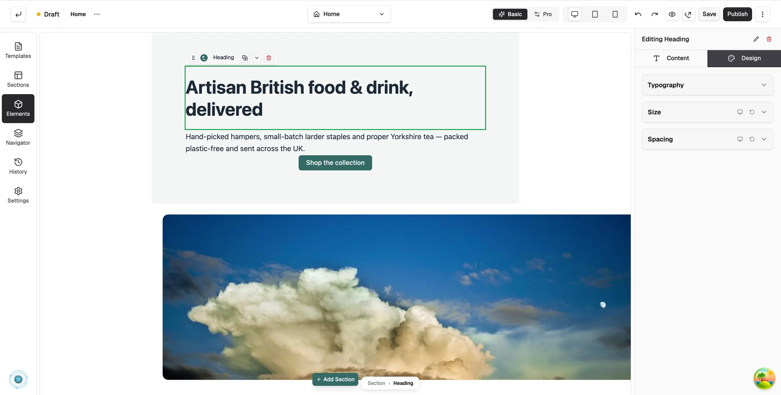
The Design tab controls how the element looks. Every group starts closed; click a group name to open it. The groups depend on the element, but you will usually find:
- Typography: font, size, weight, line height and letter spacing. Global keeps the element tied to your theme's styles. Customize breaks the link for this one element.
- Colour: text and background colours.
- Spacing: padding inside the element and, in Pro mode, margin around it.
- Border and rounded corners.
- Shadow and opacity.
- Size: width, maximum width and height. Pro mode only.
The Advance tab
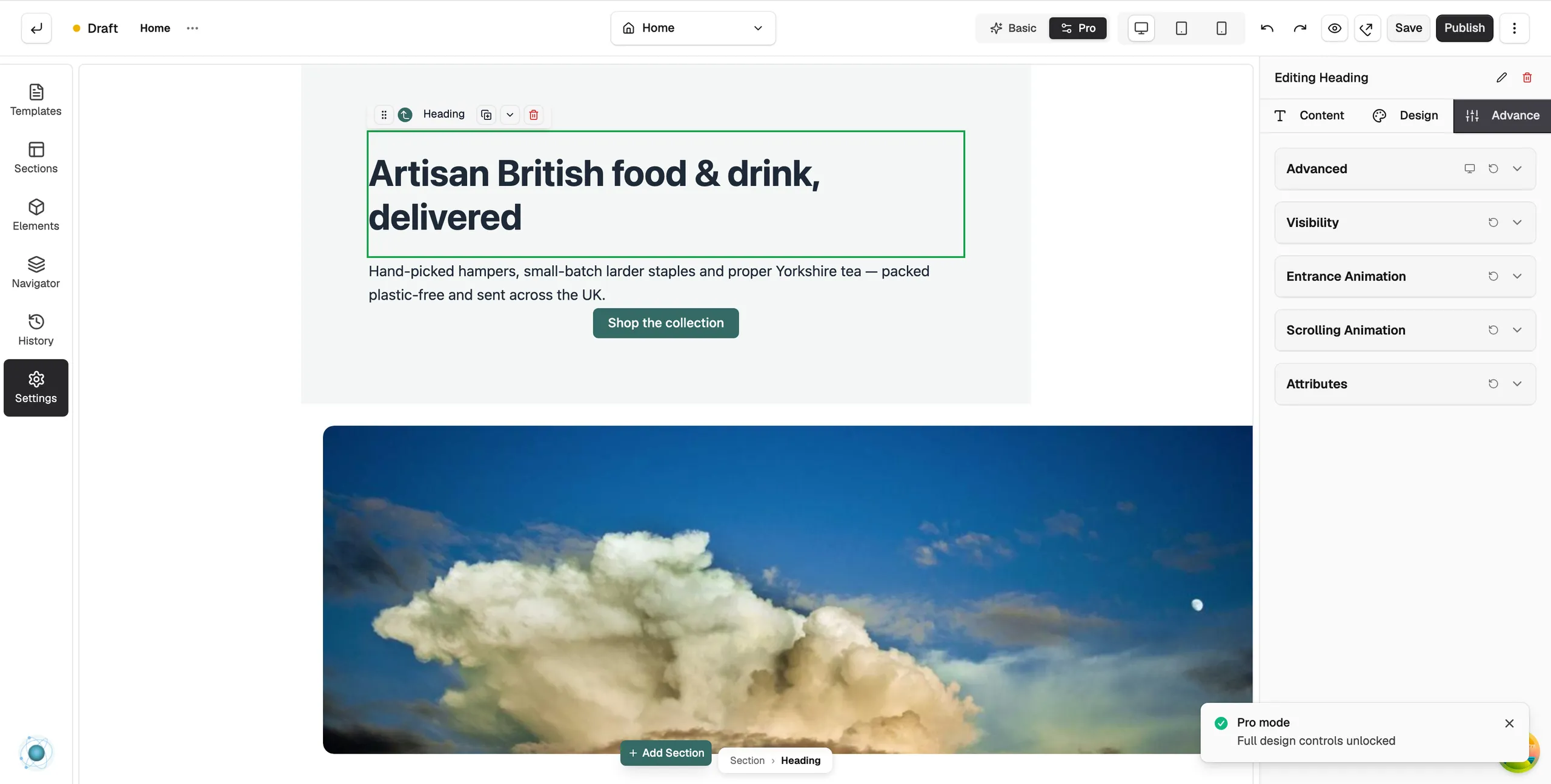
The Advance tab only shows in Pro mode. Its groups are:
- Advanced: Outer Margin, Outer Padding, Width Type, Position Type and Z-Index, plus rotate, scale, skew and translate for precise placement.
- Visibility: Hide on Desktop, Hide on Tablet and Hide on Mobile.
- Attributes: CSS ID, CSS Classes, Custom HTML Attributes and Custom CSS.
Edit for each device
Many settings can differ by device. Click Desktop, Tablet or Mobile in the toolbar, then change the setting. The canvas resizes so you can see the result. This lets you use a large heading on desktop and a smaller one on mobile.
Basic and Pro modes
The Basic mode and Pro mode toggle in the toolbar sets how much you see. The builder starts in Basic mode.
- Basic mode: locks the layout to your theme so you can edit content without breaking the design. Hides the Advance tab, the Size group and margin. You can still drag new elements in from the toolbox.
- Pro mode: shows every control and lets you drag, resize and space elements freely.
Note: In Basic mode, dragging an element that is already on the page does nothing. Switch to Pro mode to move it.
Related guides
Was this helpful?
0 people found this helpful