Building a header with the Header Builder
Create a header template, drop your logo, menu and icons into the Header Builder, set overlay and sticky behaviour, then publish it.
The Header Builder is the container that holds your storefront header: your logo, your menu and icons such as search, account and cart. You edit it in a header template rather than on a page, so one header serves every page of your store.
Add the element
A new header template already has a Header Builder on it, so you rarely add one yourself.
- From your Orbit dashboard, go to Storefront, then Templates, and click the Header tab.
- Click Create template.
- Type a name you will recognise later, and set the header as primary if you want your shop to use it.
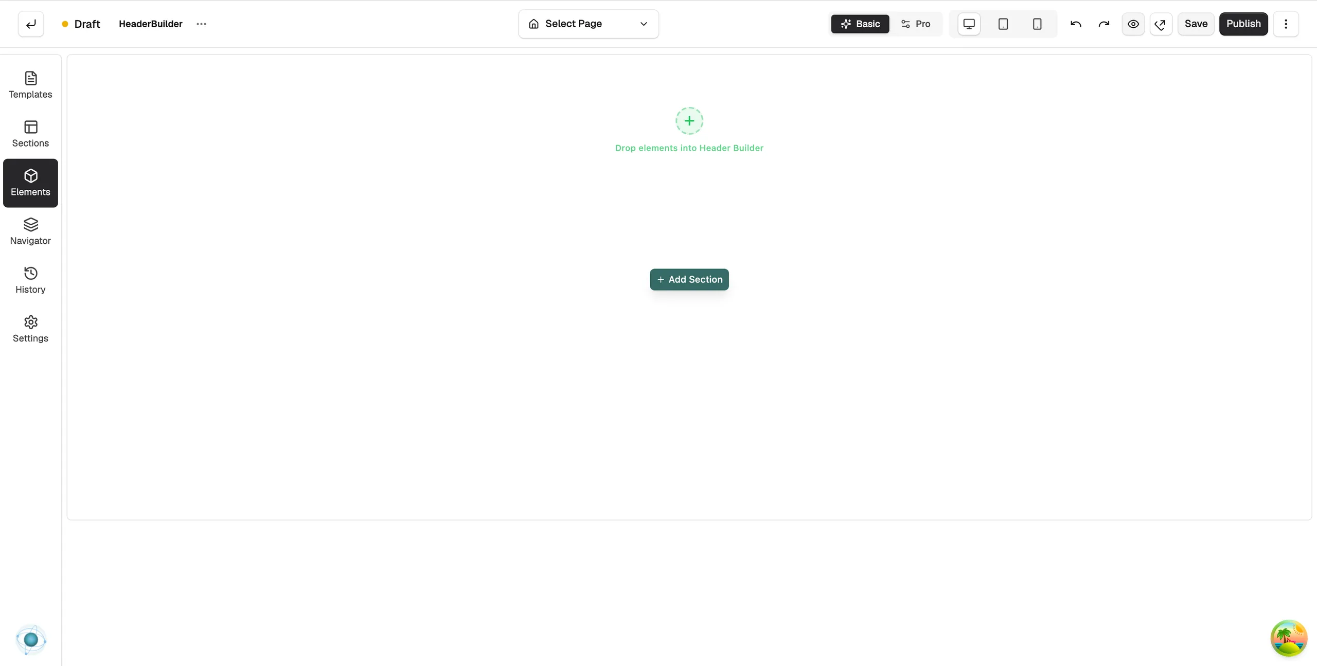
- Click Create & Edit in Builder. The page builder opens with one Header Builder on the canvas. It reads Drop elements into Header Builder.
- In the toolbox, click Elements and drag elements into the Header Builder. The Ecommerce group has Logo, the cart and the account icon.
- Click the Header Builder bar to open its settings. The panel reads Editing Header Builder.
Content settings
- Layout: Layout Type is Full Width or Boxed with a Width. Direction is Row or Column. Align Items, Justify Content, Gap and Min Height control how the elements sit in the bar, per device.
- Layout Order: the order of the elements for the device you are viewing. It needs at least two elements in the header.
- Overlay: Enable Overlay lays the header over the page content instead of above it. Choose Overlay on All pages or Homepage only. Keep Normal Styling keeps the background while overlaying.
- Sticky: Enable Sticky keeps the header on screen as customers scroll. Set Stick When, Position (Top or Bottom) and Disable At to switch it off on tablet or mobile. Hide On Scroll hides the header on the way down and reveals it on the way up.
- Scroll Effects: shows once Sticky is on. Shrink Header, Background Fade, Blur, Shadow and Scale Logo change the header as the page scrolls.
Design settings
The Design tab has Background, Border, Shadow and Spacing. Open Background to set the Background Type and Background Colour. For the Design and Advance tabs in full, see Using the element settings panel.
Publish the header
- Click Save. Your work is kept, but the header stays a Draft.
- Click Publish. In the window, turn on the Publish switch and confirm. The status changes to Published and shoppers see the new header.
Note: A header only goes live when it is both primary and published. If shoppers still see the old one, check both.
Related guides
Was this helpful?
0 people found this helpful