Building a menu with the Menu Builder element
Build a custom navigation menu on the canvas from links, buttons and dropdowns, with a built-in mobile menu.
3 min read3viewsUpdated 16 September 2026Orbit Support Team
The Menu Builder element lets you build a navigation menu on the canvas, item by item. You drag in links, buttons and dropdowns, and it comes with a mobile menu built in. Use it when you want a custom menu that is not tied to a saved navigation menu. To show a saved menu instead, use the Adding a Menu element.
Add the element
- In the page builder, click Elements in the toolbox on the left.
- Click the Advance group, or type the name in Search elements....
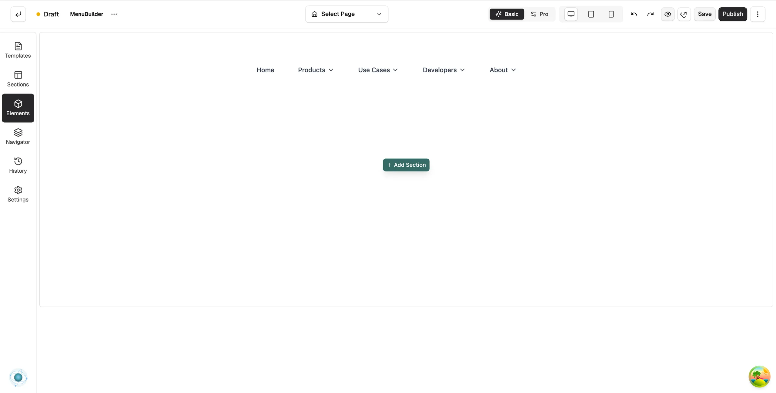
- Drag Menu Builder onto the canvas and drop it where you want it. It starts with a sample menu: Home, Products, Use Cases, Developers and About.
- Click the element on the canvas. Its settings open on the right, with a Content tab and a Design tab.
Note: The Advance group only shows in Pro mode. If you cannot see it, click Pro at the top of the builder.
Add menu items
- On the Content tab, open Add Element.
- Drag an item type into the Menu Builder on the canvas.
- Click the new item on the canvas, or in the Menu Items list, to edit its text and link.
- In Menu Items, use Move up and Move down to reorder, or Delete item to remove one.
The item types are:
- Menu Link: a plain link, such as Home or Contact.
- Menu Button: a link styled as a button, for a call to action.
- Dropdown: a link that opens a list of links in columns.
- Custom Dropdown: a link that opens a panel you fill with any elements, for a mega menu.
- Custom Area: an empty slot for other elements, such as a search bar or icons.
Design settings
The layout and mobile options are on the Design tab.
- Layout and Alignment (under Desktop Menu): how the items sit on large screens.
- Show Menu Title and Menu Title: an optional title for the menu.
- Show Mobile Menu At (under Mobile Menu): the screen size where the menu collapses behind a toggle button.
- Mode: how the mobile menu opens. For an offcanvas panel, Offcanvas Position picks the side.
- Toggle Style and Toggle Button Alignment: the look and place of the mobile toggle button.
- Other groups set fonts, colours, spacing, the dropdown panel and mobile styling.
Related guides
Was this helpful?
0 people found this helpful