Customising your checkout
Pick the 3-step or single page checkout flow and set the four brand colours, then save. Reset to defaults puts checkout back to the storefront palette.
Checkout is the last page a customer sees before they pay. You can choose how that page is laid out and pick the four colours that brand it. Find these settings at Settings, then Checkout.
Considerations
- Checkout customisation is part of the Enterprise plan. On other plans the Checkout page is not offered.
- A change applies to every checkout on your storefront as soon as you save. Orders already in progress are not affected.
- Colours must be hex values, such as #336a65.
- If you have never set a brand colour, checkout uses the primary colour from your page builder.
Choose the checkout layout
- From your Orbit dashboard, go to Settings.
- Click Checkout.
- Under Layout, click the Checkout flow menu.
- Choose 3-step (default) or Single page.
- Click Save changes. The message Checkout settings saved appears.
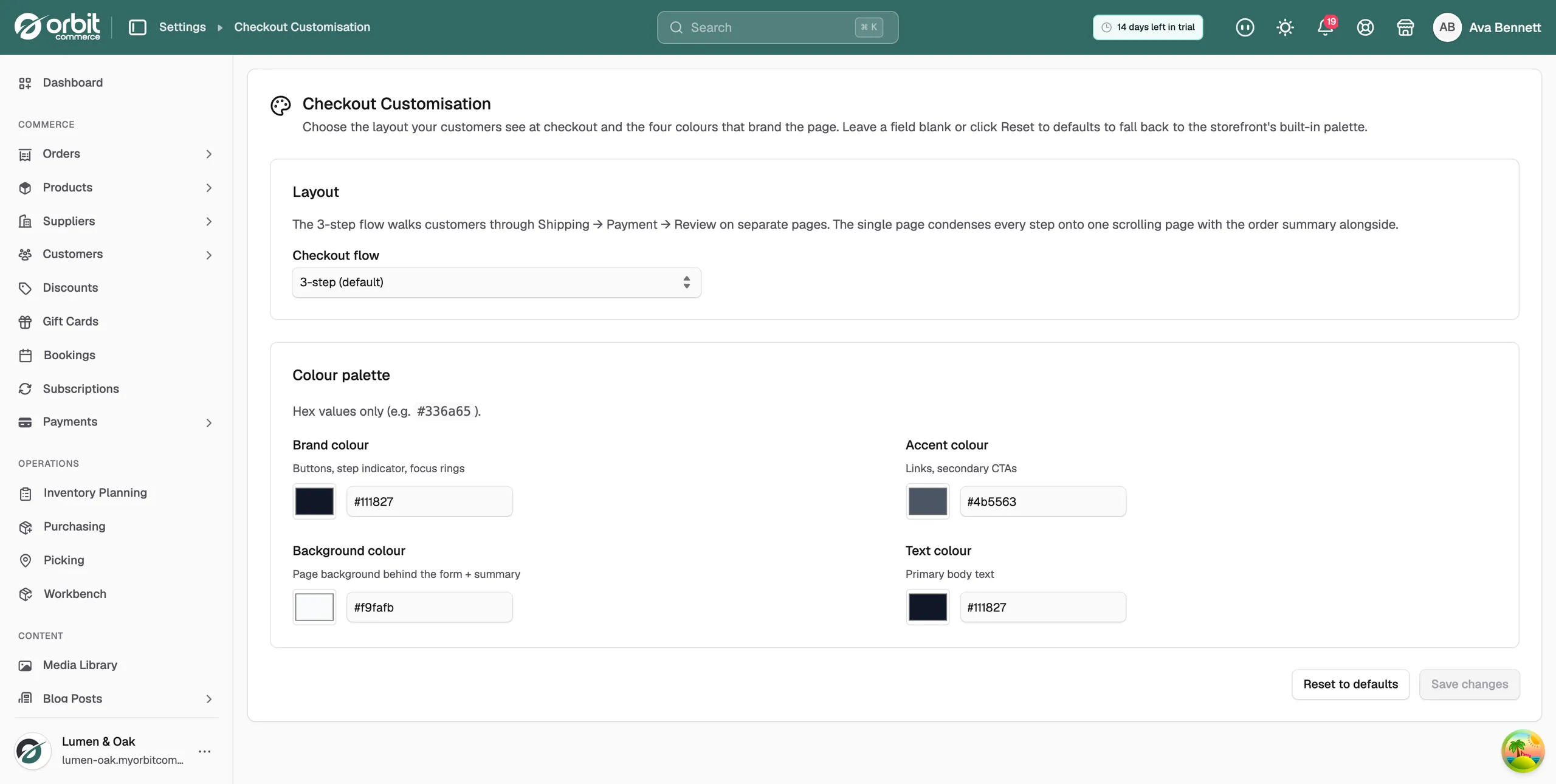
The two flows collect the same details. They differ in how they present them.
- 3-step (default): customers move through Shipping, Payment and Review on separate pages. Each screen is short, which suits first-time visitors and bigger baskets.
- Single page: every step sits on one scrolling page, with the order summary alongside. Returning customers finish faster.
Tip: If you are not sure, start with the 3-step flow, run it for a few weeks, then switch and compare how many started checkouts turn into paid orders.
Set the checkout colours
- On the Checkout Customisation page, go to Colour palette.
- For each colour, click the swatch to pick a colour, or type a hex value in the field beside it.
- Click Save changes.
There are four colours:
- Brand colour: buttons, the step indicator and focus rings.
- Accent colour: links and secondary calls to action.
- Background colour: the page background behind the form and the order summary.
- Text colour: the main body text.
A field that does not hold a hex value turns red and shows Enter a hex colour like #336a65. Save changes stays unavailable until you fix it. Save changes also stays unavailable until you change something on the page.
Reset the layout and colours
- On the Checkout Customisation page, click Reset to defaults.
- The message Reset to storefront defaults appears. Checkout goes back to the 3-step flow and the storefront palette.
Warning: Reset to defaults saves on its own. You do not click Save changes afterwards, and your colour choices are gone.
Design the checkout page itself
The flow and colours above are settings. The layout of the checkout page, and which of the ten checkout elements it holds, is a template you design in the page builder. See Designing your checkout page.
Related guides
Was this helpful?
0 people found this helpful