Page Builder | Tabs
The Tabs element organises content into tabbed panels. Customers click a tab to switch between panels, so you can present related information in the same space without making the page long.
The Tabs element organises content into tabbed panels. Customers click a tab to switch between panels, so you can present related information in the same space without making the page long. Tabs are useful for things like product details, specifications, and delivery information shown side by side.
Adding Tabs
To add a Tabs element to your page:
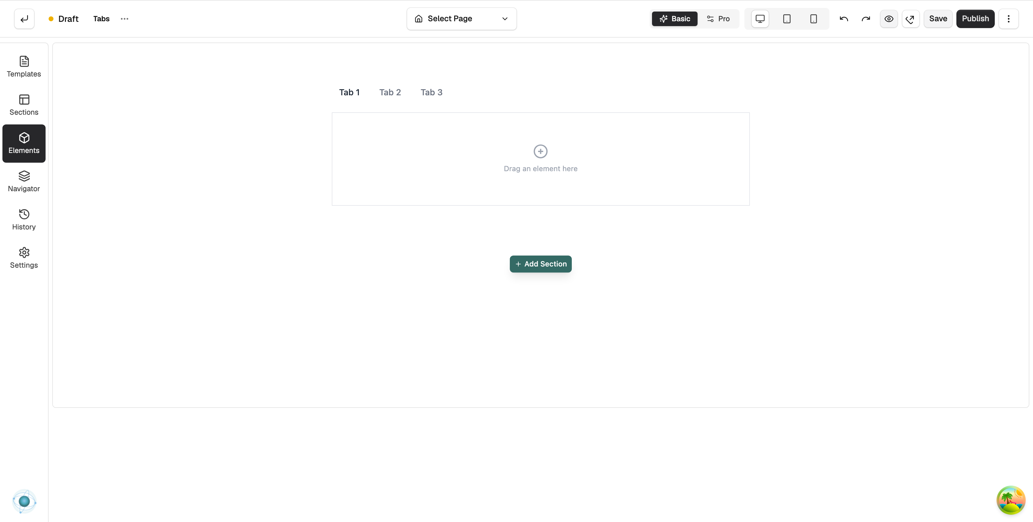
In the toolbox on the far left, click Elements.
Open the Advance group and find Tabs, or search for it.
Drag it onto the canvas and drop it where you want it.
Content settings
Select the Tabs element and open the Content tab in the settings panel to edit:
Items — the panels shown in the element, each with its own tab label and content. Add, edit, and reorder them to build the set of tabs you want, and click into a panel on the canvas to edit its content directly.
Content background colour — the background colour shown behind the content inside the active panel.
Content padding — the space between the panel content and its edges, so the text is not cramped against the border.
Content border colour — the colour of the border around the panel content.
Content border width — how thick that border is, in pixels.
Design settings
Open the Design tab to style the Tabs, including the tab typography, colours, spacing, and borders, so they match the rest of your page. For a full explanation of the Design and Advanced tabs, see the Element Settings guide.
Why this is useful
Tabs let customers find the details they want with a single click, keeping related content together and your page neat. They are a tidy way to present information that would otherwise stack up and push the page down.
If you have any questions, please contact us at support@orbitcommerce.net
Was this helpful?
0 people found this helpful