Adding a slider
Add a slider to show several slides in one space, then add slides, set the height and turn autoplay, arrows and dots on or off.
3 min read3viewsUpdated 16 September 2026Orbit Support Team
A slider shows several slides in one space. Customers move through them one at a time. Use it for a hero banner, a promotion or new arrivals. You add it in the page builder.
Considerations
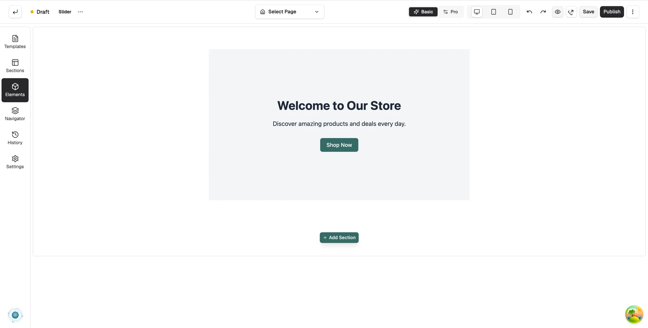
- Slider is in the Advance group. Basic mode hides that group, and search will not find it. Click Pro at the top of the page builder to switch modes.
- Many themes already place a slider on the homepage. Click it on the canvas to edit it instead of adding a new one.
- A slider keeps at least one slide. Delete slide is greyed out when only one is left.
Add the element
- Open the page in the page builder.
- If Basic is selected at the top, click Pro.
- In the toolbox on the far left, click Elements.
- Open the Advance group and find Slider, or search for it.
- Drag it onto the canvas and drop it where you want it. The settings panel opens on Editing Slider.
Add and arrange slides
- On the Content tab, open Slides. Each slide is a row in the list.
- Click Add New Slide to add one.
- Drag the handle on a row to reorder. Hover over a row for Duplicate slide and Delete slide.
- Click a row to select that slide. Its options open in the group below, named Slide 1 - Settings for the first slide.
Content settings
- Dimensions: Height Mode, either Fixed or Full Screen, and the Height in pixels.
- Content Layout: Content Max Width and Content Padding.
- Slides: the list of slides.
- Slide settings: for the selected slide, Image Source, Image Display, Overlay, Text Content (the Slide Title and Slide Description), Slide Link, Call to Action Button and Secondary Button (each with Button Text and Button Link), Content Position, Typography Colours and Button Colours.
- Behavior & Navigation: Autoplay, Autoplay Delay (ms), Pause on Hover and Infinite Loop. Further down, Show Navigation and Show Dots turn the controls customers use to move between slides on or off.
Design settings
Open the Design tab to style the arrows and dots (Navigation, Arrow Controls, Dots), the title and description text, the two buttons, and the Border and Spacing.
Related guides
Was this helpful?
0 people found this helpful