Adding a shoppable image
Turn a photo into a shoppable image by placing hotspots on the products in it. Each hotspot links to a product customers can view and buy.
2 min read3viewsUpdated 17 September 2026Orbit Support Team
A shoppable image is a photo with clickable hotspots on it. Each hotspot links to a product. Customers tap a hotspot to see the product and buy it. You add it in the page builder.
Considerations
- One image can hold up to 20 hotspots.
- Each hotspot links to one product.
- Shoppable Image is in the Ecommerce group, so you can add it in Basic mode.
Add the element
- Open the page in the page builder.
- In the toolbox on the far left, click Elements.
- Click the Ecommerce group and find Shoppable Image, or search for it.
- Drag it onto the canvas and drop it where you want it. The settings panel opens on Editing Shoppable Image. The canvas reads Select an image in the settings panel until you add a photo.
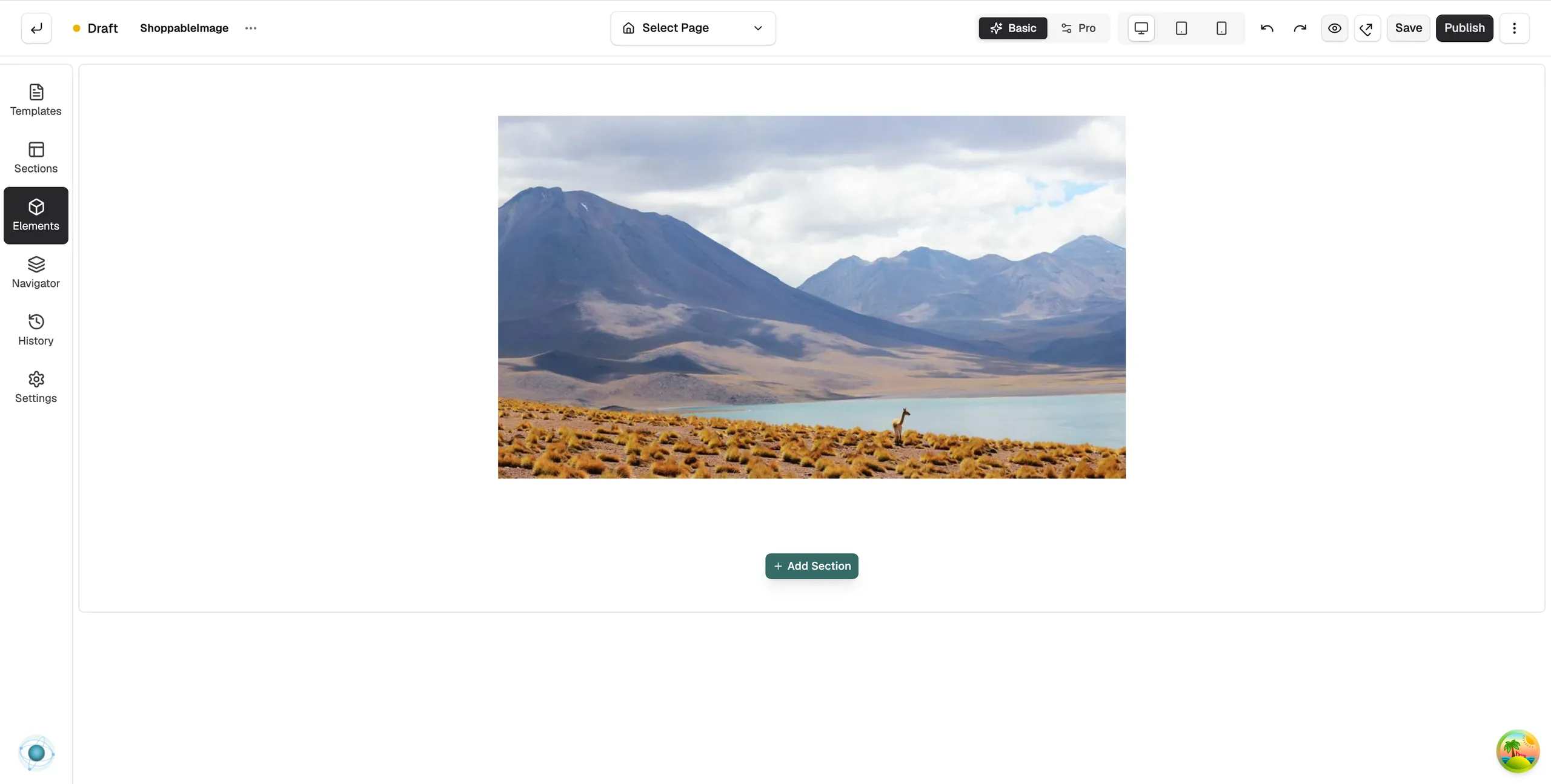
Choose the photo
- With the element selected, open the Content tab.
- Under Image, paste an image address, or click Browse to pick one from your media library. One click on a file picks it and closes the dialog.
- In Alt Text, describe the photo. Screen readers and search engines use this.
Add a hotspot
- Open the Hotspots group.
- Click Add Hotspot. A dot lands in the centre of the photo and the Select Product window opens.
- Click the product and then click Confirm. The product name shows on the hotspot card.
- On the canvas, drag the dot onto the product in the photo.
Tip: You can also click on the photo on the canvas to place a hotspot.
Content settings
- Image: the photo. Click × on the preview to remove it.
- Alt Text: a short description of the photo.
- Hotspots: one card per hotspot, showing its product and position. Click Pick or Change to set the product, or the bin icon to delete the hotspot.
- Tooltip Content: what the pop-up shows when a customer taps a hotspot. Turn Show Product Image, Show Product Price and Show View Button on or off, and set the Button Text.
Design settings
Open the Design tab to change how it looks. The groups are Hotspot Style, Tooltip Style, Image, Typography, View Button, Border and Spacing.
Related guides
Was this helpful?
0 people found this helpful