Adding a category grid
Add a Category Grid element, pick the categories it shows or show them all, and set how each card looks.
2 min read12viewsUpdated 14 September 2026Orbit Support Team
The Category Grid element shows your store categories as a grid of cards. Use it to send customers straight into the part of your catalogue they want. It shows live categories from your store.
Considerations
- A new grid is empty. On the canvas it reads No categories selected until you choose some.
- You can select up to 50 categories. The grid shows the first ones up to the Limit.
Add the element
- Open the page in the page builder.
- In the toolbox on the far left, click Elements.
- Click the Ecommerce group, or search for Category Grid.
- Drag Category Grid onto the canvas and drop it where you want it.
- Click the element on the canvas to open its settings, then click the Content tab.
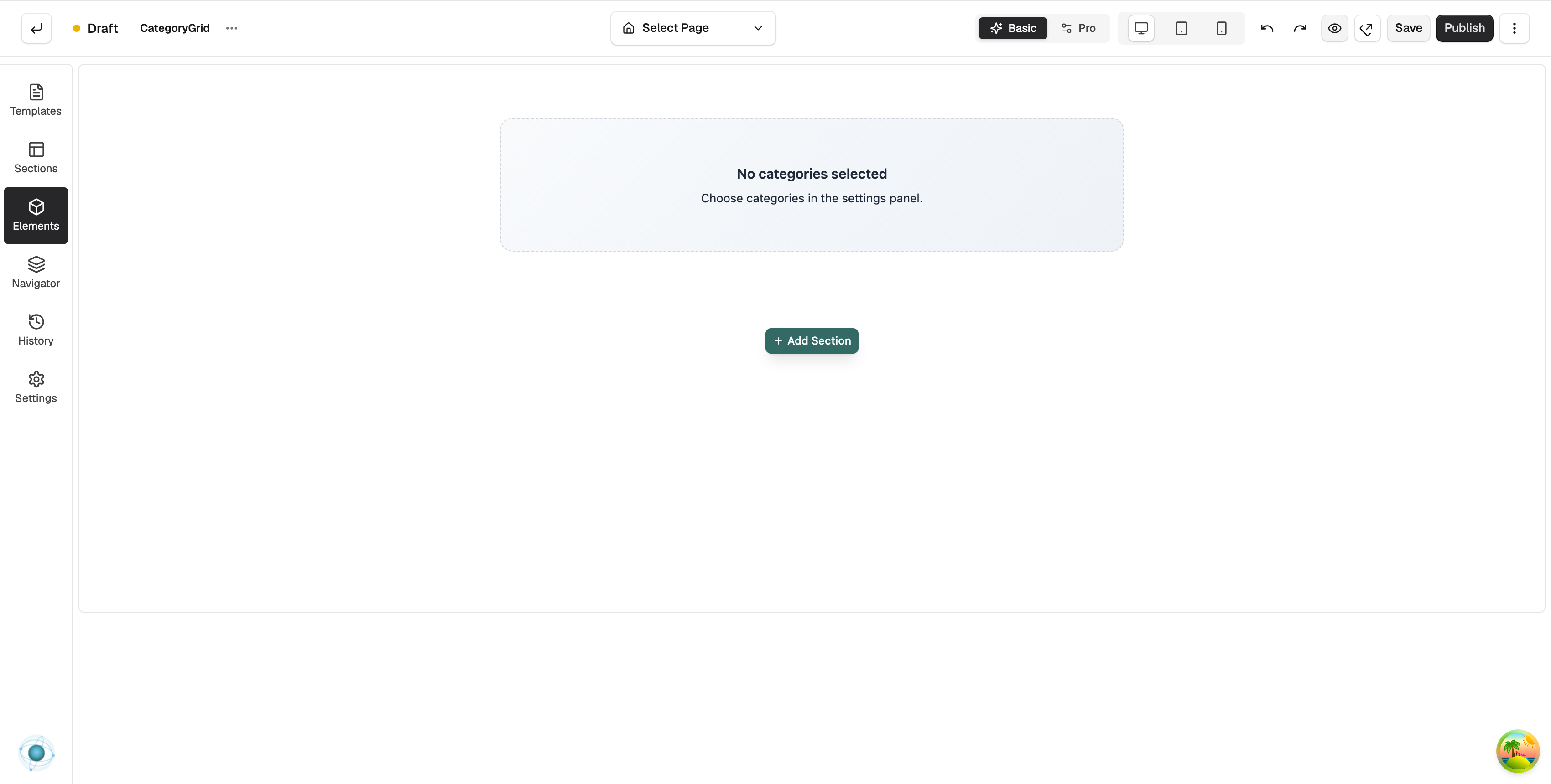
Choose the categories
- Under Source, set Categories to Pick categories manually or All categories.
- If you chose manual, open the Categories group and click Select. The Select Categories window opens.
- Tick the categories you want and click Confirm. The cards appear on the canvas.
- Set Limit to the number of cards to show.
- Click Save at the top right.
Note: All categories shows every active category, in the order set on your Categories page.
Content settings
- Source: Categories (manual or all) and Limit.
- Categories: shows which are Selected, with Select and Clear buttons. Only shown for manual picking.
- Content: Content Alignment and Card Alignment (Left, Center, Right); toggles for Show Description, Show Product Count and Show Arrow; Title Lines, Desc Lines and Max Chars to cut long text.
- Promo banner: Show banner slot adds a space for a banner. Banners are set up under Storefront and appear for the category being viewed.
- Placeholder Image: a URL for an image used by any category that has no picture.
- Empty State: whether the empty message shows, and its Message.
Design settings
The Design tab has Layout, Card Style, Image, Title, Description, Arrow Icon, Hover & Shadow, Carousel and Typography groups. The number of columns is under Layout. For the Design and Advance tabs in full, see Using the element settings panel.
Related guides
Was this helpful?
0 people found this helpful