Adding a product grid
Show products from a category, tag, brand or a hand-picked list in a grid on any page, then set sorting, card content, badges and columns.
The Product Grid element shows a set of products from your store in a grid. Use it to feature a category, new arrivals, sale items or hand-picked products.
Considerations
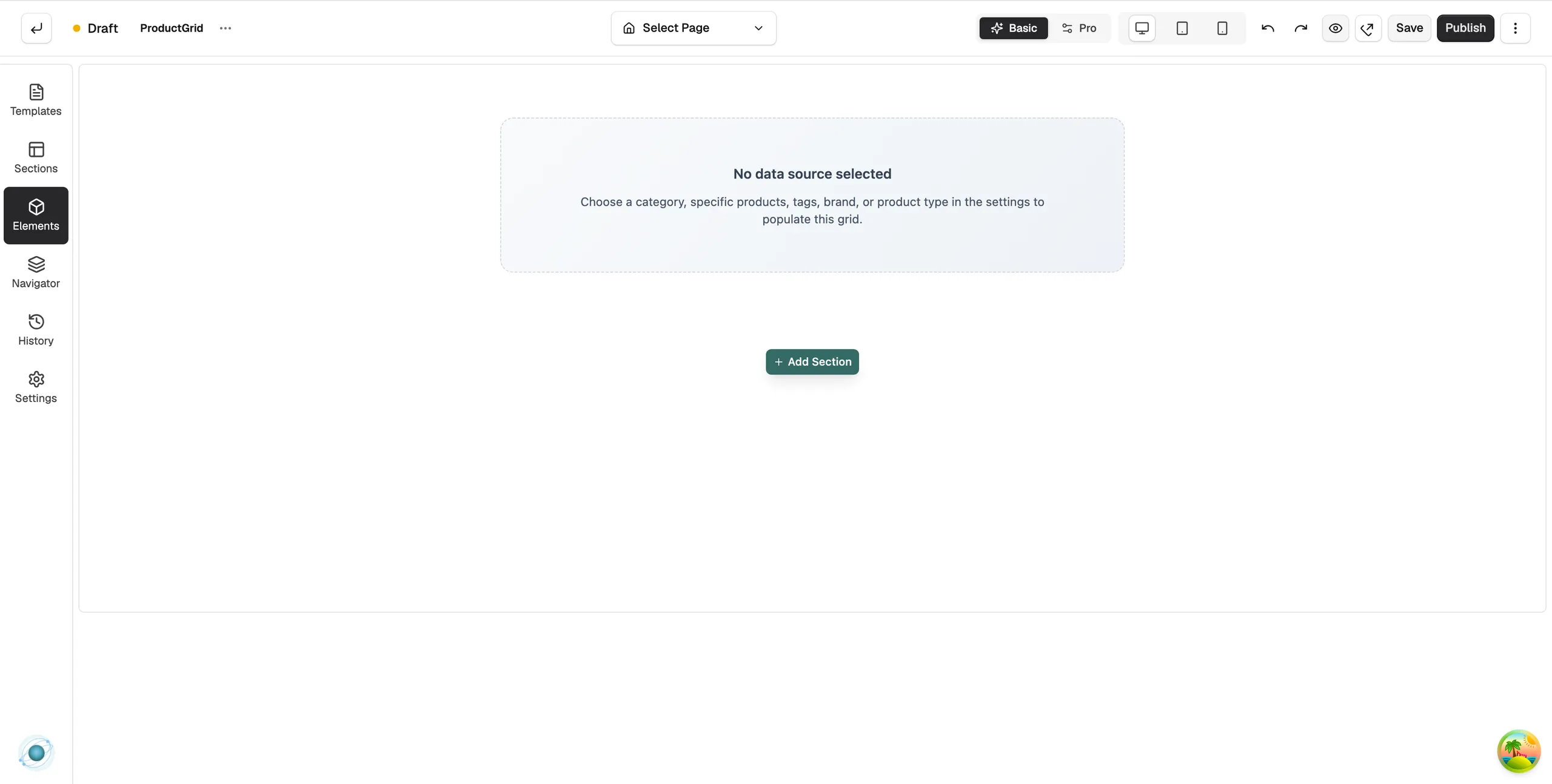
- A new grid shows No data source selected until you tell it where products come from.
- Specific Products lets you hand-pick up to 20 products. For more, use a category, tag or brand.
Add the element
- Open the page in the page builder. For your homepage, go to Storefront, then Themes, and click Customize.
- In the toolbox on the left, click Elements.
- Open the Ecommerce group and find Product Grid, or search for it.
- Drag it onto the canvas and drop it where you want it. If you drop it at the bottom of the page, it lands in a section of its own.
Choose which products to show
- Click the grid. The settings panel opens on the right, headed Editing Product Grid.
- Under Data Source, set Data Source Type. Choose All Products, Category, Specific Products, Tags, Brand or Product Type.
- Set the matching option below it. For a category, click Select, pick the category, then click Confirm. The products appear in the grid.
- Click Save. To put it live, click Publish, then Save & Publish.
Content settings
The rest of the Content tab is in groups.
Under Query & Merchandising:
- Products per page: the most products the grid shows at once.
- Sort By: Default, price up or down, Newest, Oldest, Title A-Z or Title Z-A.
- Pagination: None (fixed), Load more button, Infinite scroll or Numbered pages.
- Hide Out Of Stock and Only On Sale: filters for what is shown.
Under Card Content: switches for Price, Compare Price, Description, Brand, Badges and Add to Cart Button, plus Title Lines and Desc Lines to cap the text on each card.
Under Pricing & Actions: Price Range for products with variants, and the wording of Add to Cart Text and Choose Options Text.
Under Badges: Sale Badge and Sold Out Badge switches, with Sale Text and Sold Out Text.
Design settings
On the Design tab, the Layout group sets Mode (a grid or a carousel), Columns and Gap. Columns can differ per device: 4 on desktop, 2 on tablet and 1 on mobile by default. Card Style and Hover & Shadow style each card. For the tabs in full, see Using the element settings panel.
Related guides
Was this helpful?
0 people found this helpful