Adding a search box
Add a search box or a search button that opens a dialog, then set what it searches, how results sort, and what the dropdown shows.
2 min read2viewsUpdated 16 September 2026Orbit Support Team
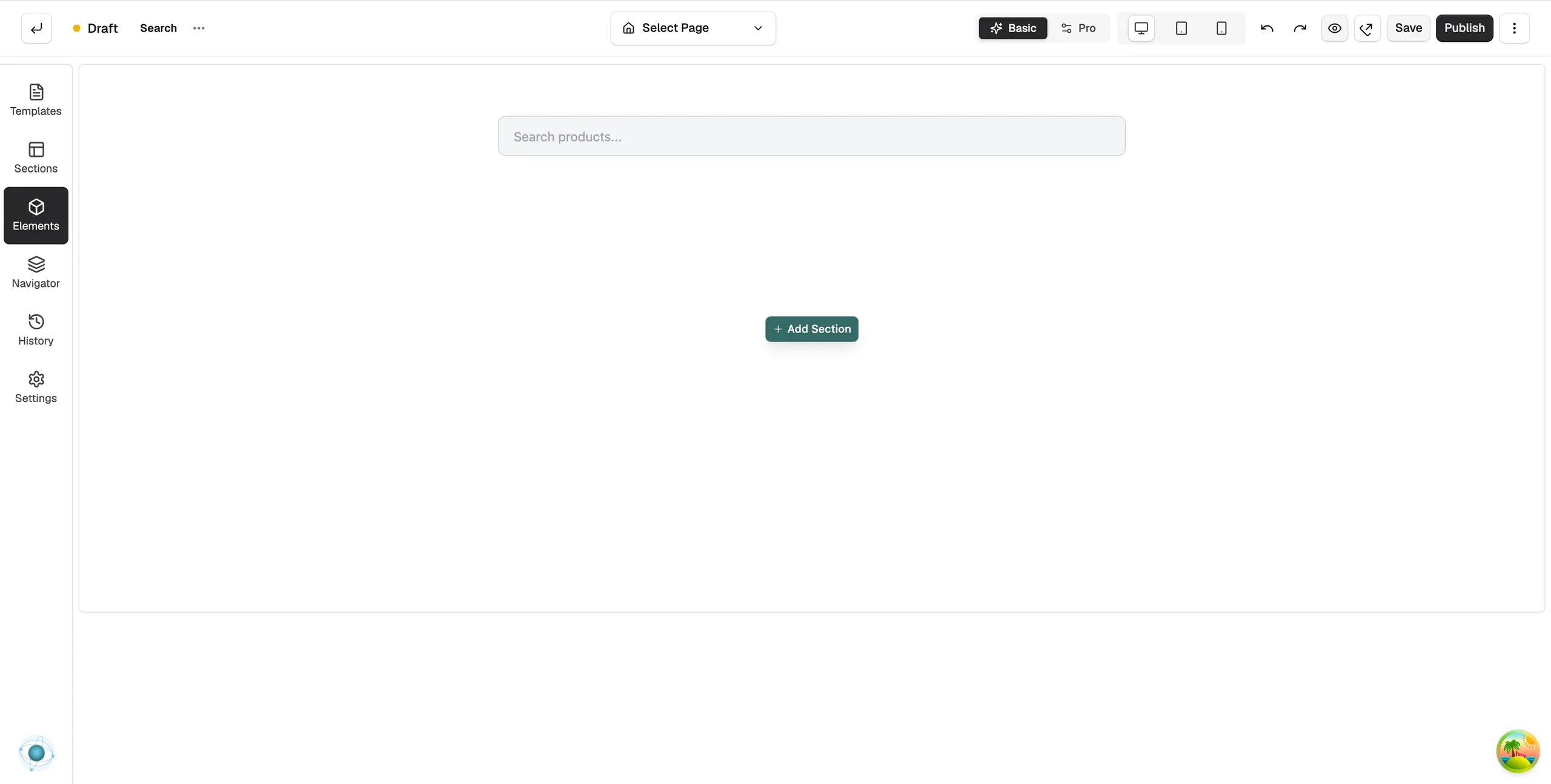
The Search element adds a search box to a page. Most stores put it in the header so customers can search from anywhere. It searches your products and shows results as the customer types.
Add the element
- Open the page in the page builder. For your header, go to Storefront, then Templates, and open the header.
- In the toolbox on the left, click Elements.
- Open the Ecommerce group and find Search, or search for it.
- Drag it onto the canvas and drop it where you want it. It works straight away with its default settings.
Content settings
Click the element to open its settings. The Content tab starts with Display Mode:
- Search Box (Inline Input): a text field on the page. This is the default.
- Button (Opens Dialog): a button or icon that opens a search dialog.
The groups below change with the mode.
- Search Box: Placeholder text, Width, Show Submit Button, and On Submit, which either goes to the search page or shows results in a dropdown. Switches for Show Products, Show Categories and Show Suggestions control what the dropdown holds.
- Trigger Button: for dialog mode. Button Icon, Button Display (Icon Only, Icon + Text or Text Only), Button Text and Icon Position.
- Dialog Header: Show Dialog Title and the Dialog Title text.
- Search Behavior: Result Types, Result Limit, Partial Search (Exact Match, Contains or Starts With) and Sort By.
- Suggestions: Enable Suggestions, Suggestion Types and Min Characters to Search.
- Text Labels: the wording for No Results Text and the headings for products, collections, blogs and pages.
Design settings
The Design tab has groups for the search box, the search button, the trigger button, the dropdown and each part of the dialog. Use them to match colours, borders and sizes to your header. For the Design and Advance tabs in full, see Using the element settings panel.
Related guides
Was this helpful?
0 people found this helpful