Adding a Menu element
Show a saved navigation menu on a page or header, with dropdowns and a mobile menu. Covers picking the menu and every layout setting.
2 min read4viewsUpdated 16 September 2026Orbit Support Team
The Menu element shows one of your saved navigation menus on a page or in a header, with dropdowns for nested links. You build the links once under Storefront, then Navigation, and the element keeps up with any changes you make there.
Considerations
- The element needs a navigation menu to show. If you have not made one, see Building your navigation menus first.
- To build a menu by hand on the canvas instead, use the Building a menu with the Menu Builder element.
Add the element
- In the page builder, click Elements in the toolbox on the left.
- Click the Advance group, or type the name in Search elements....
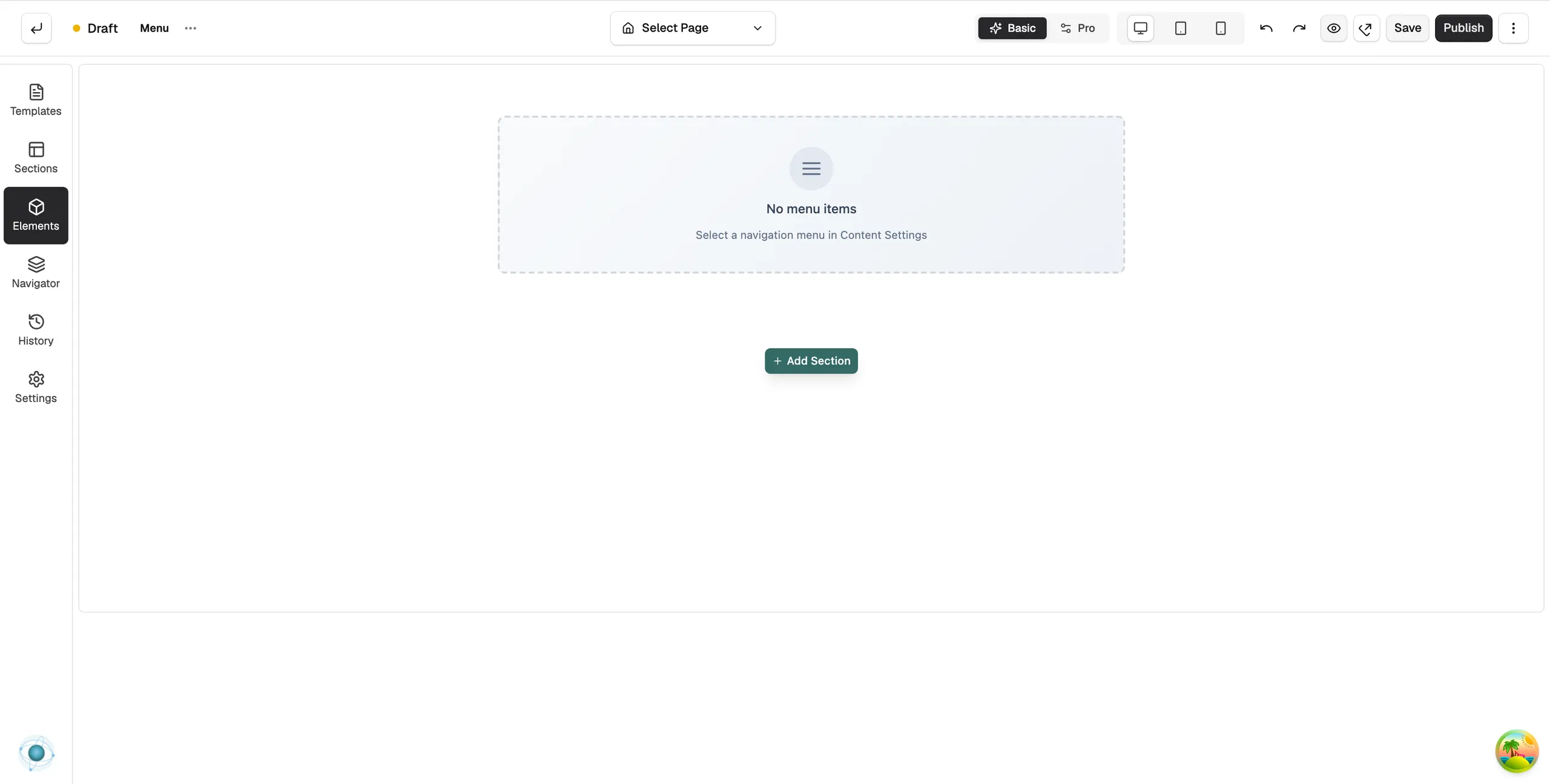
- Drag Menu onto the canvas and drop it where you want it. The panel closes on its own. The element reads No menu items until you pick a menu.
- Click the element on the canvas. Its settings open on the right.
- Under Pick a menu, click Select Navigation and choose one of your menus. The box then shows the menu's name, its handle and how many items it has. Click Change Navigation to swap it later.
Note: The Advance group only shows in Pro mode. If you cannot see it, click Pro at the top of the builder.
Content settings
- Layout: items side by side (Horizontal) or in a stack (Vertical).
- Alignment: Left, Center, Right or Space Between.
- Show All Items by Default: show every nested item open instead of behind a dropdown.
- Behavior (under Dropdown): open dropdowns on Hover or on Click.
- Normal Icon and Active Icon: the icon next to an item with a dropdown, closed and open.
- Toggle Icon (under Mobile Menu): the button customers tap to open the menu on phones and tablets. Show Toggle Icon turns it on or off.
- Menu Type: how the mobile menu opens: Drawer (Slide from side), Dropdown (Below icon), Overlay (Center screen) or Fullscreen.
- Drawer Position: Left or Right, when the type is Drawer.
Design settings
Open the Design tab to set the fonts, colours, spacing and the look of the dropdown and mobile panels. For what the Design and Advance tabs do on every element, see Using the element settings panel.
Related guides
Was this helpful?
0 people found this helpful