Building a banner grid with the Masonry Layout element
Build a grid of banners in mixed sizes, each with an image, heading, text and button. Covers grid, banner and design settings.
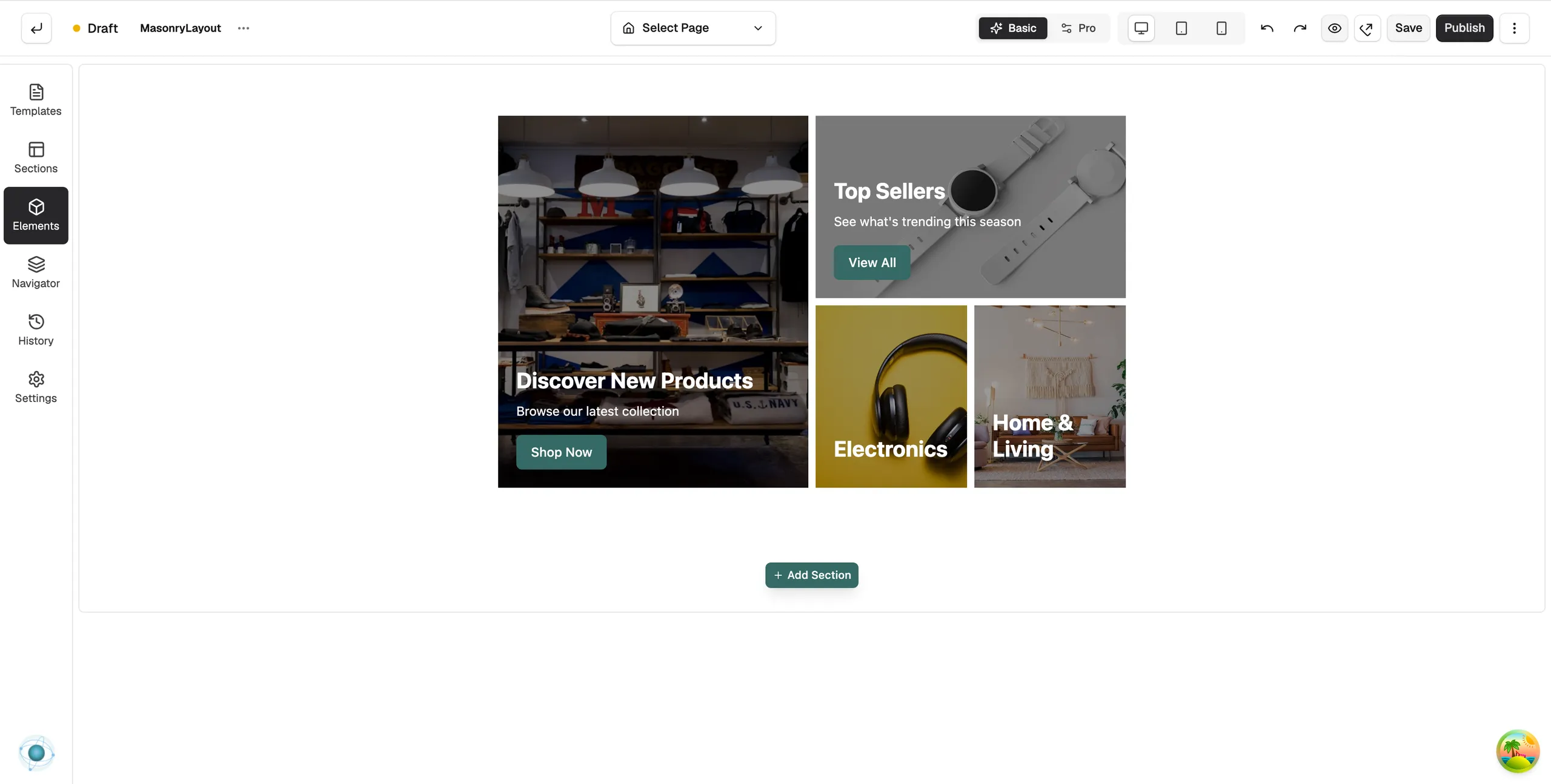
The Masonry Layout element is a grid of banners in different sizes. Each banner has a background image, a heading, a short line of text and an optional button, and each can be a different width and height. Use it to show several collections or offers in one block.
Add the element
- In the page builder, click Elements in the toolbox on the left.
- Click the Advance group, or type the name in Search elements....
- Drag Masonry Layout onto the canvas and drop it where you want it. The panel closes on its own.
- Click the element on the canvas. Its settings open on the right, with a Content tab and a Design tab.
Note: The Advance group only shows in Pro mode. If you cannot see it, click Pro at the top of the builder.
Grid settings
These sit under Layout at the top of the Content tab.
- Row Height: the height of one grid row in pixels. Tall banners span more rows.
- Gap: the space between banners in pixels.
Add and edit banners
- Open the Banners group. Each banner is a row in the list.
- Click Add New Banner to add one. Use Duplicate banner to copy one, or Delete banner to remove it.
- Click a banner to open its settings, headed Banner 1 - Settings and so on.
Each banner has these settings:
- Width: how much of the row it takes: 25%, 33.33%, 50%, 66.66%, 75% or 100%.
- Row Span: how tall it is: 1 Row, 2 Rows (Tall) or 3 Rows (Extra Tall).
- Image URL (under Background Image): pick from your media library or paste a URL. Position sets which part of the image stays in view. Fit is Cover, Contain or Fill.
- Colour and Opacity (under Overlay): a tint over the image so the text stays readable.
- Heading, Heading Tag and Description (under Text Content): the words on the banner.
- Link (under Banner Link): makes the whole banner clickable. Search for a page or enter a custom URL.
- Button Text and Button Link (under Button): leave the text empty to hide the button.
- Horizontal and Vertical (under Content Position): where the text sits on the banner.
Design settings
Open the Design tab to set the heading and description fonts and colours, and the button style. For what the Design and Advance tabs do on every element, see Using the element settings panel.
Related guides
Was this helpful?
0 people found this helpful