Adding payment icons
Show the payment methods you accept as a row of icons. The icons follow your payment settings; you set the label, size, spacing and alignment.
2 min read2viewsUpdated 16 September 2026Orbit Support Team
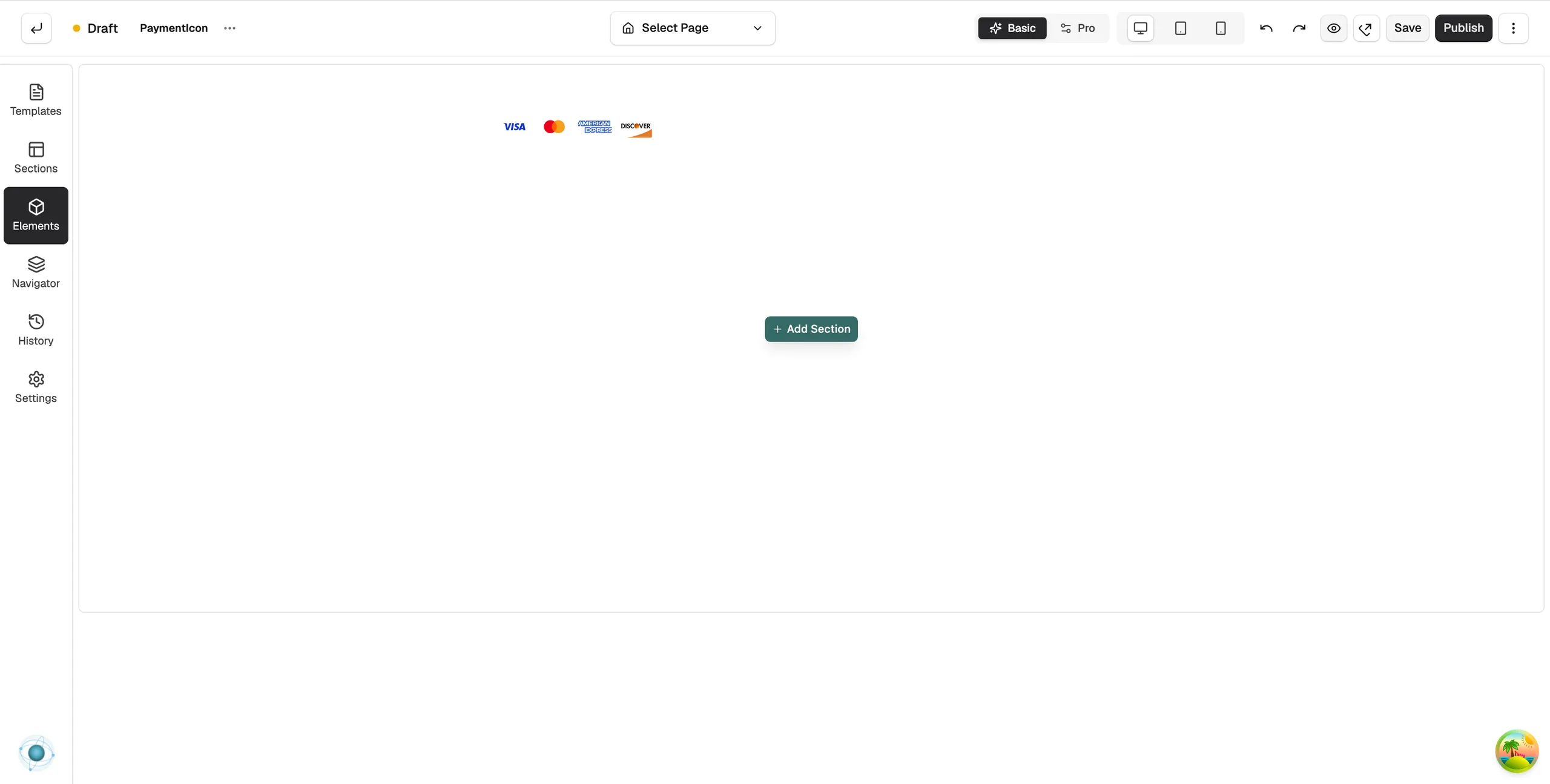
The Payment Icon element shows the payment methods you accept as a row of icons. Put it in your footer or near the checkout so customers can see their card or wallet is accepted.
Considerations
- The icons come from your Orbit Payments set-up. Turn a payment method on in your payment settings and its icon appears. You do not pick icons by hand.
- Icons stay in step with your settings. If you turn a method off, its icon goes.
Add the element
- Open the page in the page builder. For your homepage, go to Storefront, then Themes, and click Customize.
- In the toolbox on the left, click Elements.
- Open the Ecommerce group and find Payment Icon, or search for it.
- Drag it onto the canvas and drop it where you want it.
Content settings
Click the element to open its settings. On the Content tab, the Payment Icons group explains where the icons come from. The Label group has two settings:
- Show Label: turns on a short line of text next to the icons.
- Label Text: the wording of that label, such as We accept.
Design settings
The Design tab has three groups.
- Icon: Icon Height, Gap between icons, Opacity, and Grayscale to show the icons in grey.
- Label: Font Size and Colour of the label text.
- Layout: Alignment, set to Left, Center or Right.
For the Design and Advance tabs in full, see Using the element settings panel.
Related guides
Was this helpful?
0 people found this helpful