Adding a progress bar
Add a bar that fills to a percentage you set, choose where its label sits, and make it animate as it scrolls into view.
2 min read2viewsUpdated 16 September 2026Orbit Support Team
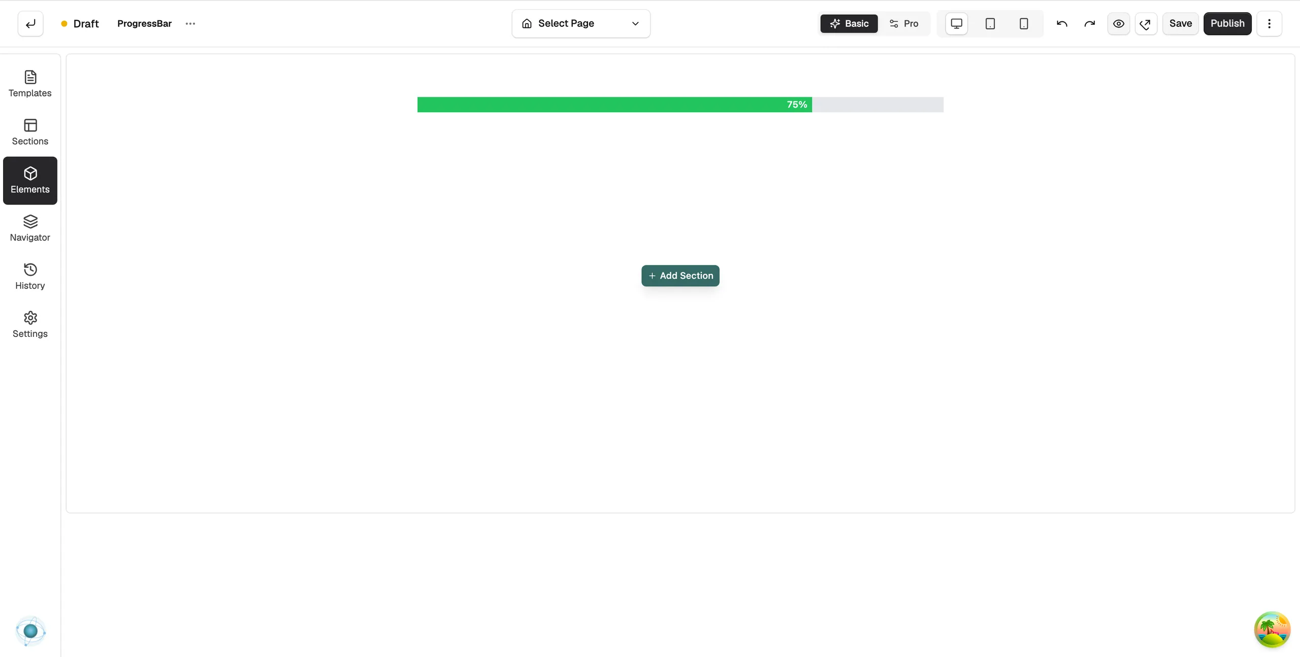
The Progress Bar element shows a bar that fills to a level you set. Use it to show progress towards a goal, a rating or any value that works as a percentage. It can fill as it scrolls into view.
Add the element
- Open the page in the page builder. For your homepage, go to Storefront, then Themes, and click Customize.
- In the toolbox on the left, click Elements.
- Open the Basic group and find Progress Bar, or search for it.
- Drag it onto the canvas and drop it where you want it.
Content settings
Click the bar to open its settings. The Content tab has two groups.
Under Progress:
- Progress: how full the bar is, as a percentage.
- Show Label: where the percentage shows. None hides it, Inside Bar puts it on the bar, Above Bar puts it over the bar.
Under Animation:
- Animation: None (Static) for no movement, Animate on View to fill when the bar scrolls into sight, or Scroll Driven to fill as the page moves.
- Start: the level the bar begins from, as a percentage, before it fills to its final value.
- Duration (ms): how long the fill takes, in milliseconds.
- Delay (ms): how long to wait before the fill starts.
Design settings
- Bar Appearance: Height, Width, Bar Colour for the filled part and Background Colour for the track.
- Border: border and rounded corners.
- Label: Colour, Font Size, Font Weight, Line Height and padding for the percentage label.
For the Design and Advance tabs in full, see Using the element settings panel.
Related guides
Was this helpful?
0 people found this helpful