Adding a feature list
Add a Feature List to a page, edit each feature's icon or image, title, description and button, and set the layout, columns and colours.
The Feature List element shows a row of short selling points, each with an icon or image, a title and a description. Use it for things like free delivery, easy returns and secure checkout. It arrives with four example features already filled in: Free Delivery, Easy Returns, Secure Checkout and Sustainable.
Add the element
- Open the page in the page builder.
- In the toolbox on the far left, click Elements.
- Click the Basic group, or type feature in Search elements.... Type the singular word. features does not find it.
- Drag Feature List onto the canvas and drop it where you want it. Or click it to add it to the column you are working in.
- Click the element on the canvas. Its settings open on the right, with Feature 1 already open.
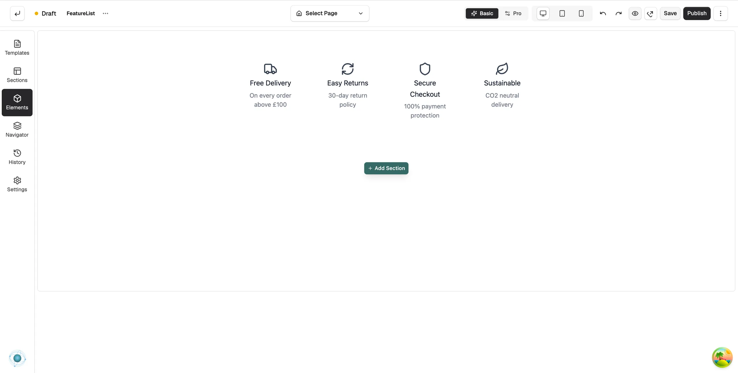
Content settings
Each feature has its own group, named Feature 1, Feature 2 and so on. Click a group to open it. Inside each group:
- Media Type: Icon or Image.
- Icon: click Select icon to pick from the icon library. Shown when Media Type is Icon.
- Image: paste an image URL or click Browse to pick from your media library. Shown when Media Type is Image.
- Title: the feature name, such as Free Delivery.
- Description: one short line under the title.
- Button Text: the label of an optional button. Leave it empty to hide the button.
- Button Link and Link Target: where the button goes, and whether it opens in the Same Window or a New Window. These appear once you type some button text.
Use Move Up, Move Down and Remove at the bottom of a group to reorder or delete a feature. Click Add Feature below the groups to add another.
Design settings
The Design tab has these groups. All of them start closed.
- Layout: Columns, Gap, Content Spacing, Alignment and Icon Position, either Top (Stacked) or Left (Inline). The list starts at four columns on desktop, two on tablet and one on mobile.
- Icon Style: Icon Size and Icon Color.
- Typography: fonts for the Title and the Description.
- Item Style: Background Color and Padding for each feature.
- Image Style: Image Width, Image Height, Object Fit and Border Radius, for features that use an image.
- Button Style and Hover Effects: colours, size and hover behaviour for the buttons.
- Border and Spacing.
For the Design and Advance tabs in full, see Using the element settings panel.
Related guides
Was this helpful?
0 people found this helpful