Page Builder | Columns
The Columns element splits a section so you can place content side by side. Use it for layouts such as an image next to a block of text, or three features in a row, with control over how the columns stack on smaller screens.
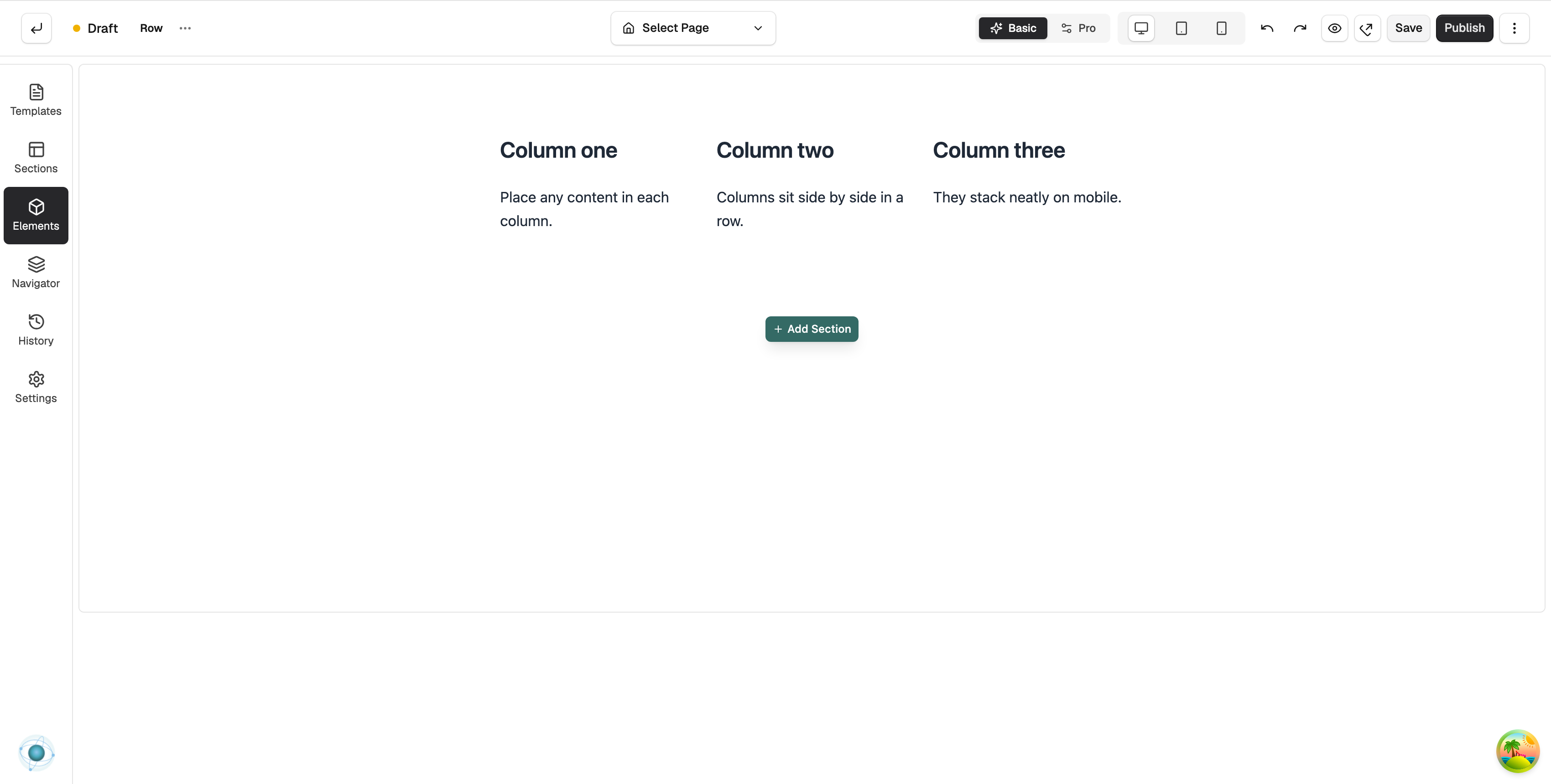
The Columns element splits a section so you can place content side by side. Use it for layouts such as an image next to a block of text, or three features in a row, with control over how the columns stack on smaller screens. Columns give you flexible layouts within a single band of the page.
Adding a Columns element
To add a Columns element to your page:
In the toolbox on the far left, click Elements.
Find Columns in the Structure group, or search for it.
Drag it onto the canvas and drop it where you want it.
Content settings
Columns is a layout container, so it has no content of its own. You build it up by dropping other elements into each column, and you control how it looks from the Design tab. There you can set the number of columns and how wide each one is, the spacing between them, the background, and how the columns stack on tablet and mobile so your layout still looks right on smaller screens.
Design settings
Open the Design tab to style the Columns, including the number and width of columns, the gap between them, alignment, and spacing. For a full explanation of the Design and Advanced tabs, see the Element Settings guide.
Why this is useful
Columns let you arrange content side by side and create balanced, flexible layouts that adapt to every device, giving your pages a more polished, professional look.
If you have any questions, please contact us at support@orbitcommerce.net
Was this helpful?
0 people found this helpful