Adding a button
Add a Button element, set its text and link, add an icon, and choose a style from your theme.
2 min read1viewsUpdated 16 September 2026Orbit Support Team
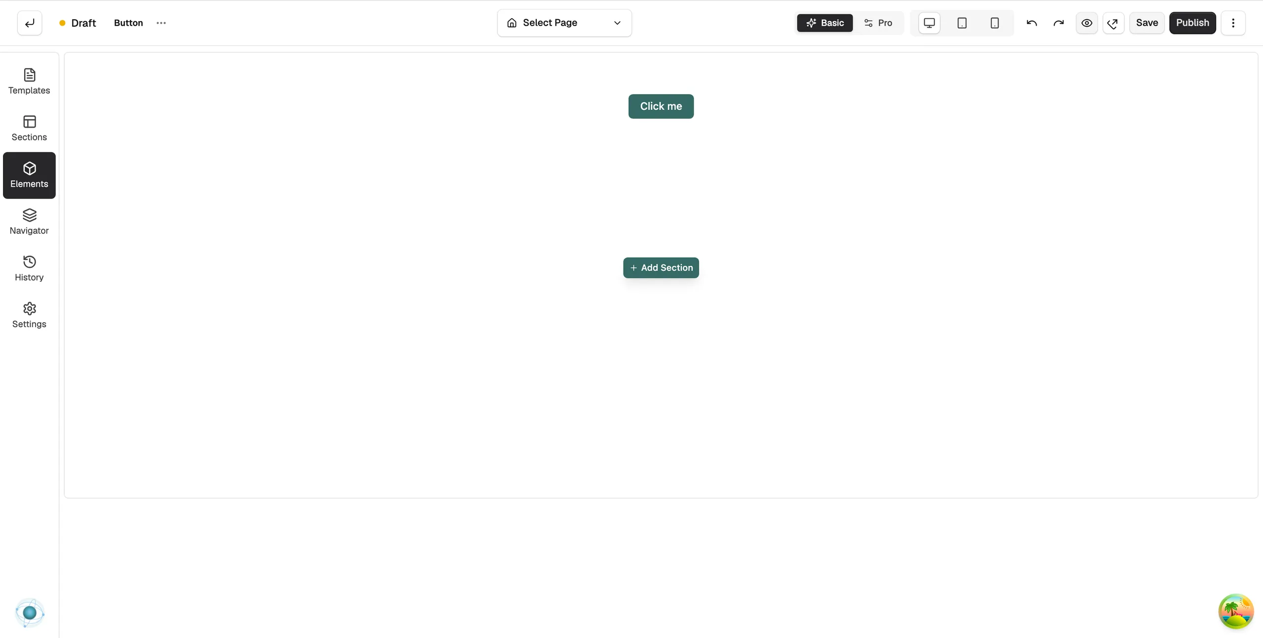
The Button element adds a clickable button to a page. Use it to send customers to a product, a category or any other link. A clear button gives customers their next step.
Add the element
- Open the page in the page builder.
- In the toolbox on the far left, click Elements.
- Click the Basic group, or search for Button.
- Drag Button onto the canvas and drop it where you want it.
- Click the element on the canvas to open its settings, then click the Content tab.
Set the link
- Under Link Settings, click the Link field. The Edit Button Link window opens.
- Enter the address and choose whether it opens in a new tab. The panel then shows Opens in new tab.
- Click Save at the top right.
Content settings
Button Content
- Button Text: the label on the button, such as Shop now.
- Icon: an optional icon shown with the label.
- Icon Position: Before Text, After Text or Icon Only.
- Icon Size and Icon Spacing: the size of the icon and the gap between it and the text.
- Accessible Label: for icon-only buttons. What a screen reader says. If empty, it uses the Button Text.
Link Settings
- Link: the address the button opens.
- Link Title: a short description of the link.
- No Follow: tells search engines not to follow the link.
Design settings
The Design tab has Button Style, Button Size, Background, Label and Typography groups. Under Button Style you can use one of your theme's global button styles, so every button matches, or set your own. Button Size has Small, Medium, Large and Custom presets. For the Design and Advance tabs in full, see Using the element settings panel.
Related guides
Was this helpful?
0 people found this helpful